01RoleRol
UX/UI designer
in trainingUX/UI designer
in opleiding
01 WorkWerk
Selected workGeselecteerd werk
03 PiecesStuks
Case No.I
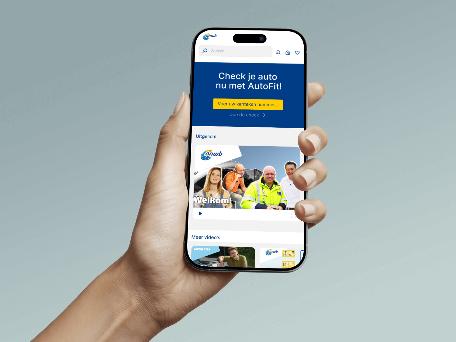
ANWB AutoFit · Team FixVooruit
Designed the mobile UI for ANWB's AutoFit maintenance check. Turning technical vehicle data into screens that anyone can understand.
Mobiele UI ontworpen voor ANWB's AutoFit onderhoudscheck. Technische voertuigdata vertaald naar schermen die iedereen begrijpt.
Read case studyLees case study →01 / ANWB
Case No.II
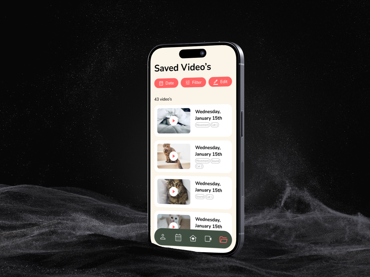
Baque · Team Mauve
Designed the video playback section of Baque, a smart cat-feeder app. Building screens for saved recordings, editing, filtering, and sharing.
De video-sectie ontworpen van Baque, een slimme kattenvoer-app. Schermen gebouwd voor opgeslagen opnames, bewerken, filteren en delen.
Read case studyLees case study →02 / Mauve
Case No.III
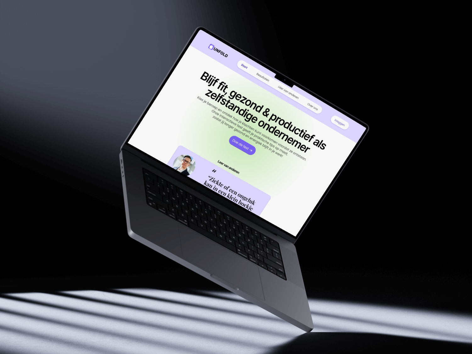
UNFOLD · Team Unfold
Researched and designed a digital reflection tool for freelancers. Translating interview insights into an experience that feels personal, not clinical.
Onderzoek en ontwerp van een digitale reflectie-tool voor freelancers. Interviewinzichten vertaald naar een ervaring die persoonlijk voelt, niet klinisch.
Read case studyLees case study →03 / UNFOLD