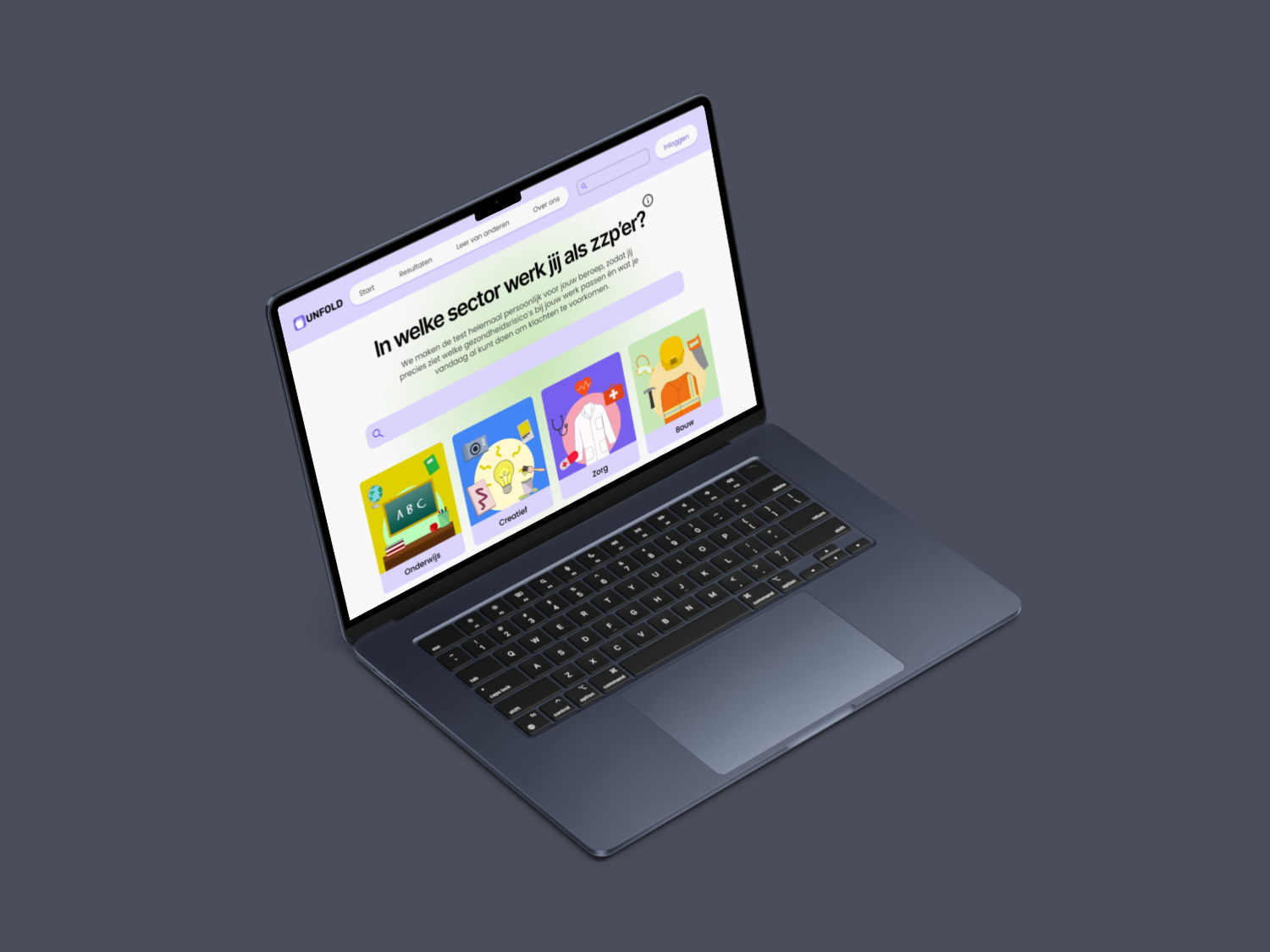
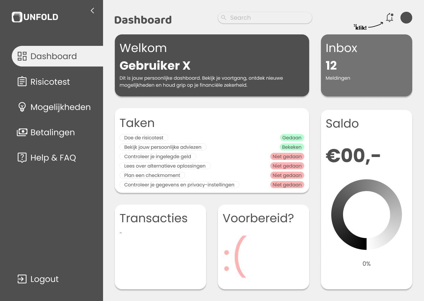
Fig. I · UNFOLD homepage
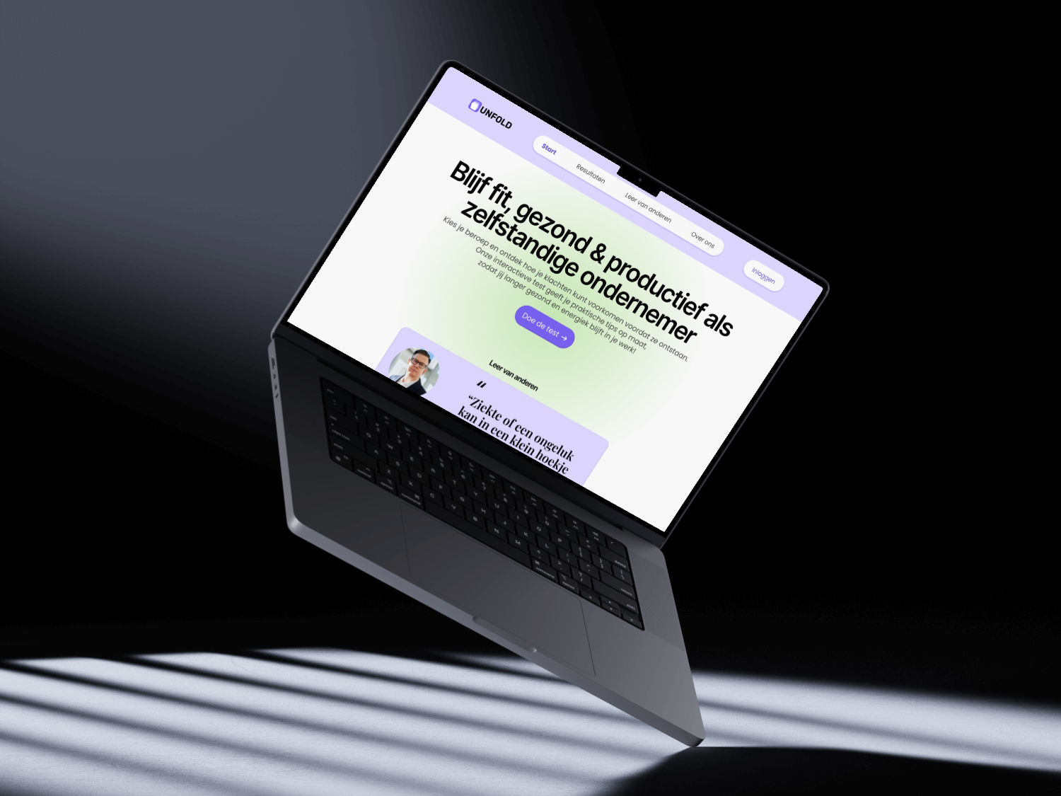
For the Social Design Factory, commissioned by the Dutch Ministry of Social Affairs and Employment, our team of five tackled a real problem: many freelancers in the Netherlands struggle with isolation and the inability to switch off from work, but don't recognise these as risks until it's too late.
Our brief: design a digital tool that makes freelancers more aware of these risks, without being preachy or clinical.
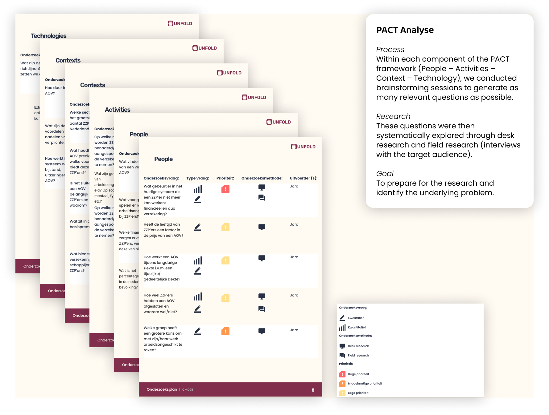
We started with a PACT Analysis. Brainstorming questions across People, Activities, Context, and Technology, then answering them through desk research and interviews with freelancers.
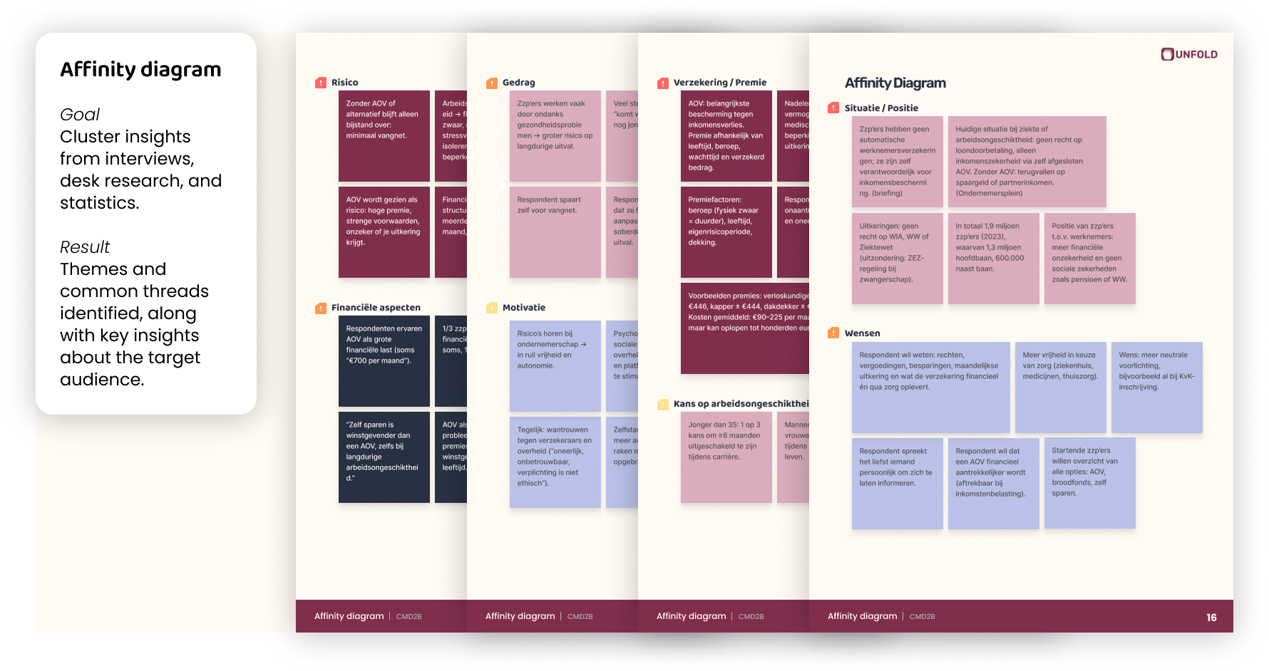
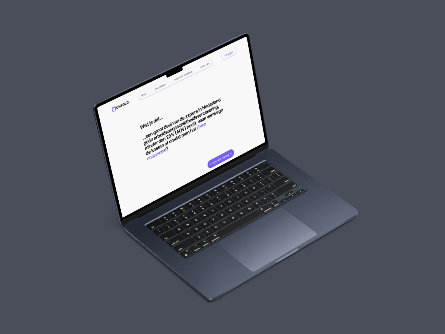
From there, I used an Affinity Diagram to cluster everything we found (interviews, statistics, desk research) into themes. The key insight: freelancers don't respond well to "you have a problem" messaging. They respond to reflection. Gentle prompts that let them draw their own conclusions.
That insight shaped every visual decision. We needed something that feels like a personal journal, not a medical questionnaire.
I translated that into a low-contrast palette, warm tones, generous whitespace, and a tone of voice that prompts without pushing. The goal was to lower the barrier. Make it feel safe to be honest with yourself.
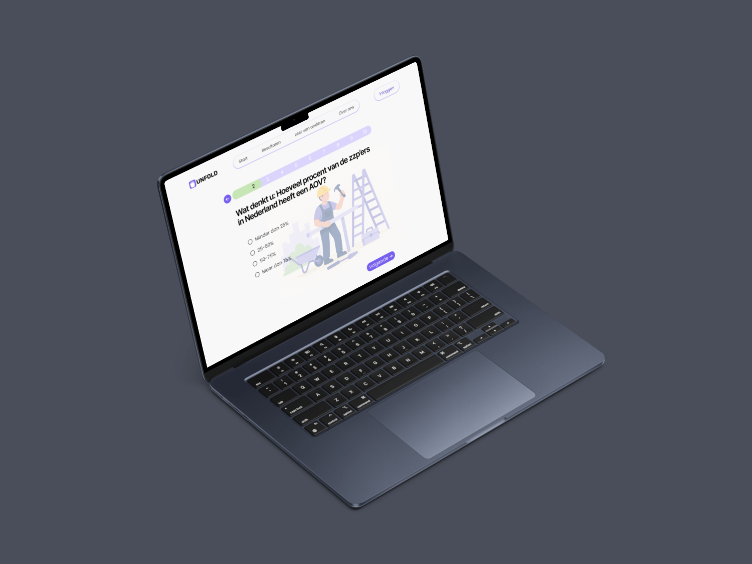
After usability testing, we discovered that users skipped the reflection questions when they were presented as a long form. I redesigned the flow to show one question at a time with subtle progress indication.
In the next test round, all five participants completed the full reflection. In the first round, only one did.
Reflection completion rate after the flow redesign. Every participant in round two finished the full questionnaire.
The best interfaces don't just look good. They respect how people think and feel.
This project shaped my identity as a designer. I learned that the best interfaces don't just look good. They respect how people think and feel.
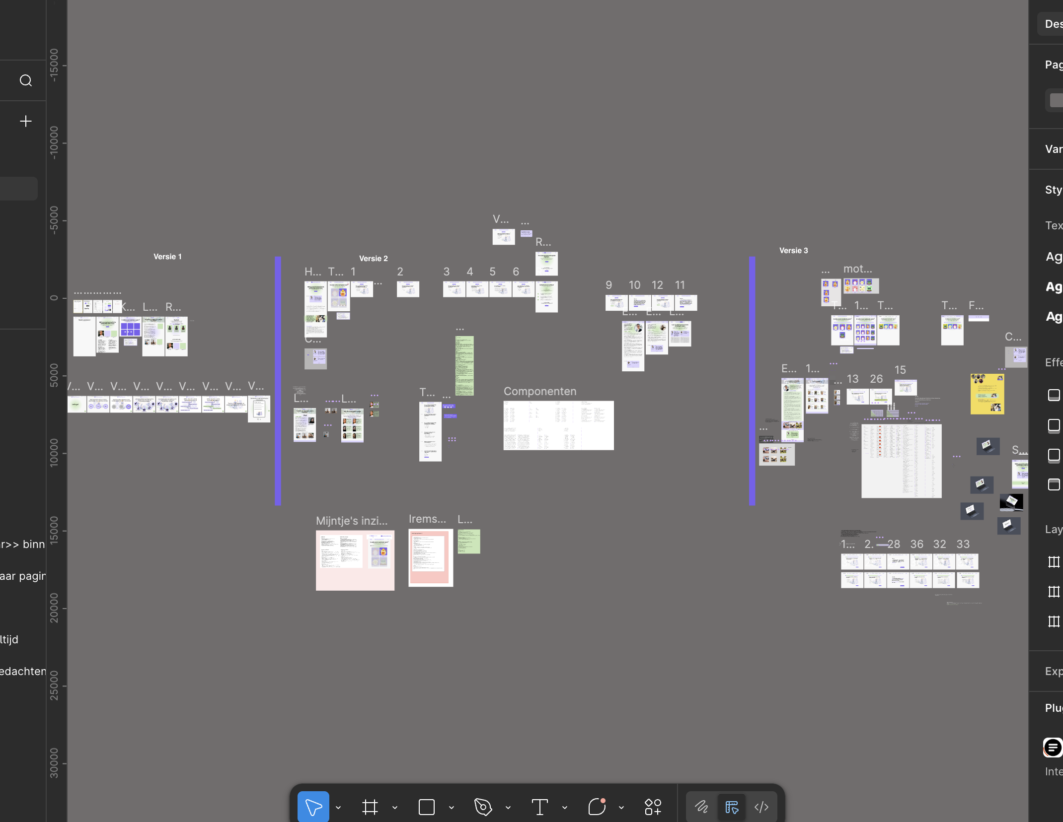
I also learned the value of killing your darlings. My first visual direction (see Fig. IX) was too playful for the sensitive topic, and accepting that feedback early made the final result much stronger.