Fig. I · AutoFit overview
ANWB asked us to design an accessible, visually appealing web page for their AutoFit project, a maintenance check meant to be integrated into the existing ANWB site. The brief: let users enter their license plate and immediately receive a personal maintenance overview, including expected costs and links to relevant How-To videos.
Why it mattered: the target audience increasingly runs into trouble when small car issues spiral into expensive repairs they can't afford. AutoFit needed to give them grip on their maintenance before that happens, protecting both their wallet and their mobility.
The technical data behind it is dense. Tire wear, oil levels, brake status, service history. Team FixVooruit had to turn that into a mobile experience that feels clear and helpful, not overwhelming.
Through desk research and interviews, we sharpened the target group: Dutch drivers on a low to modal income who rely heavily on their car but have limited technical knowledge and a thin financial buffer. Single parents. Older people without public transport access. Families in rural areas.
This group often drives older cars and worries that a small issue will spiral into a costly repair. AutoFit had to give them grip on their maintenance and protect their mobility, without sounding like a mechanic.
My role quickly shifted toward mobile UI. The core challenge I took on: how do you present technical car data on a phone screen without making someone feel like they need a mechanic's manual to understand it?
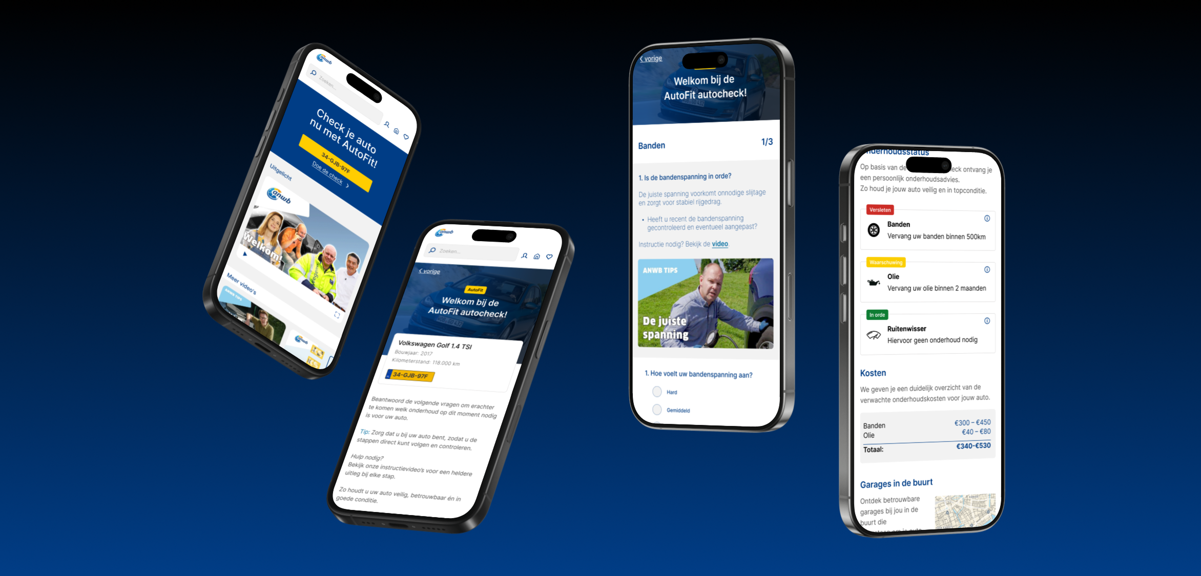
We made the choice to go mobile-first, because our tests showed that most users open this kind of info on their phone. The visual language stayed close to the existing ANWB brand for recognisability and trust.
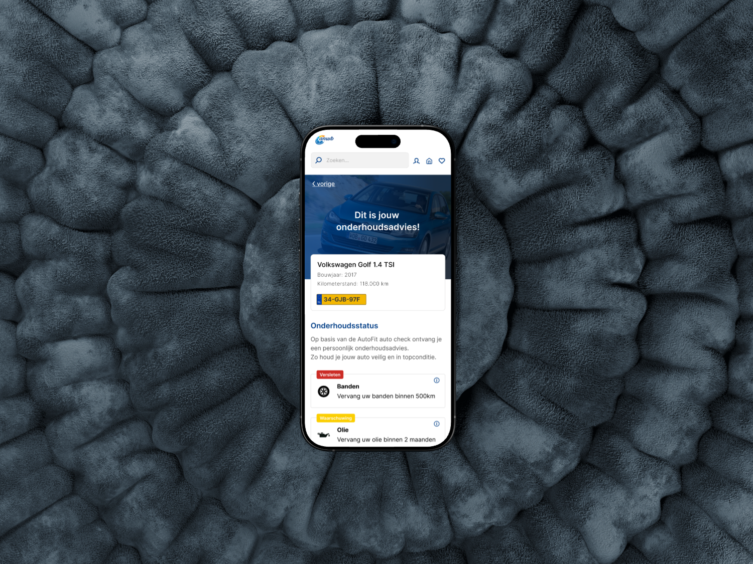
I designed each screen around one primary action or status. The check flow breaks the process (license plate, vehicle overview, individual checks, recommendations) into focused steps. No scrolling through long technical lists. For the overview, I prioritised what users care about most: "is my car okay?" and "what needs attention?"
A few decisions worth calling out, each driven by testing:
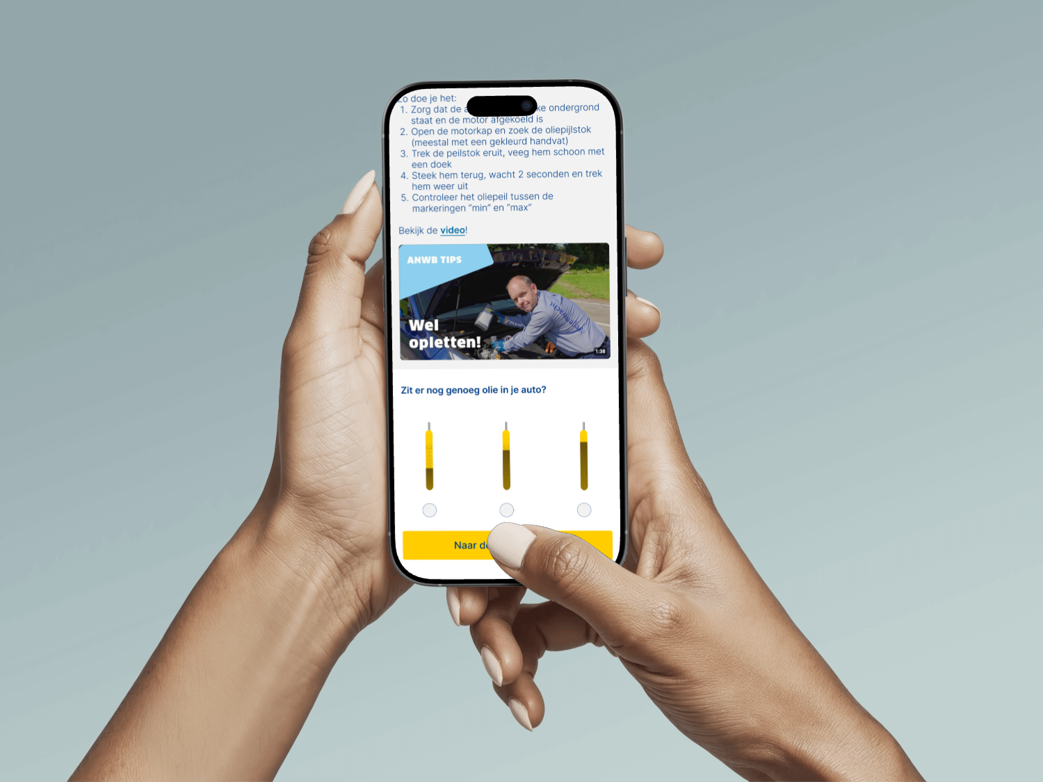
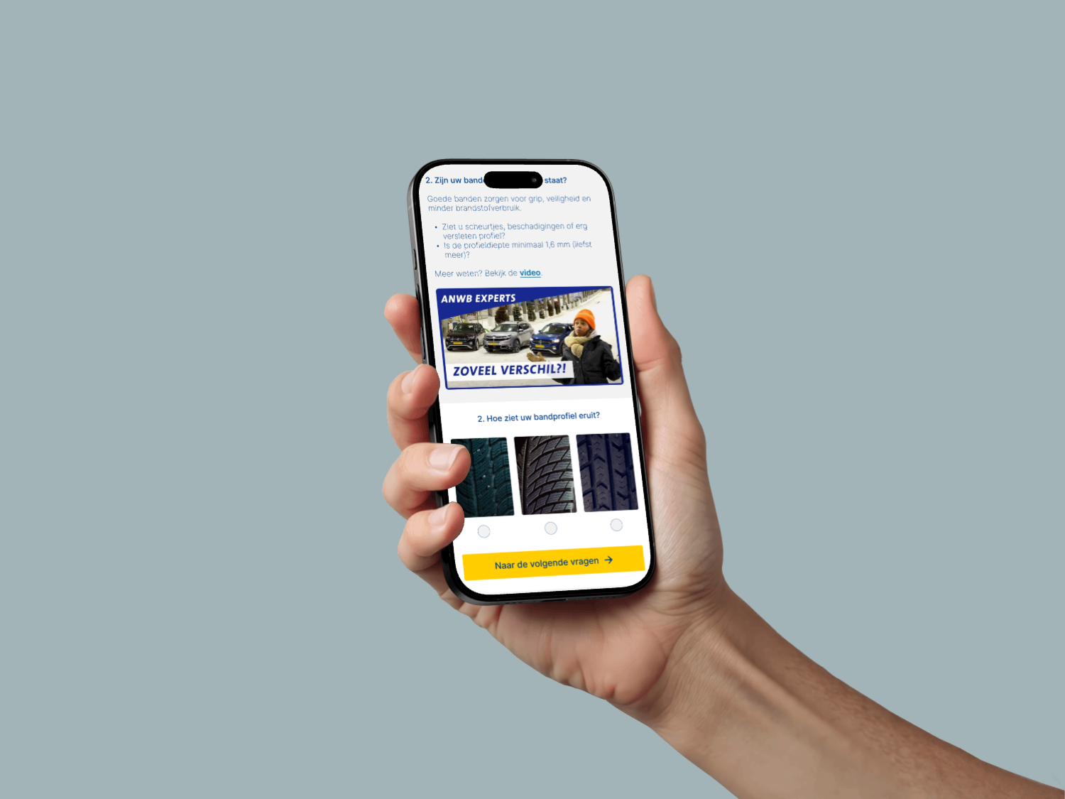
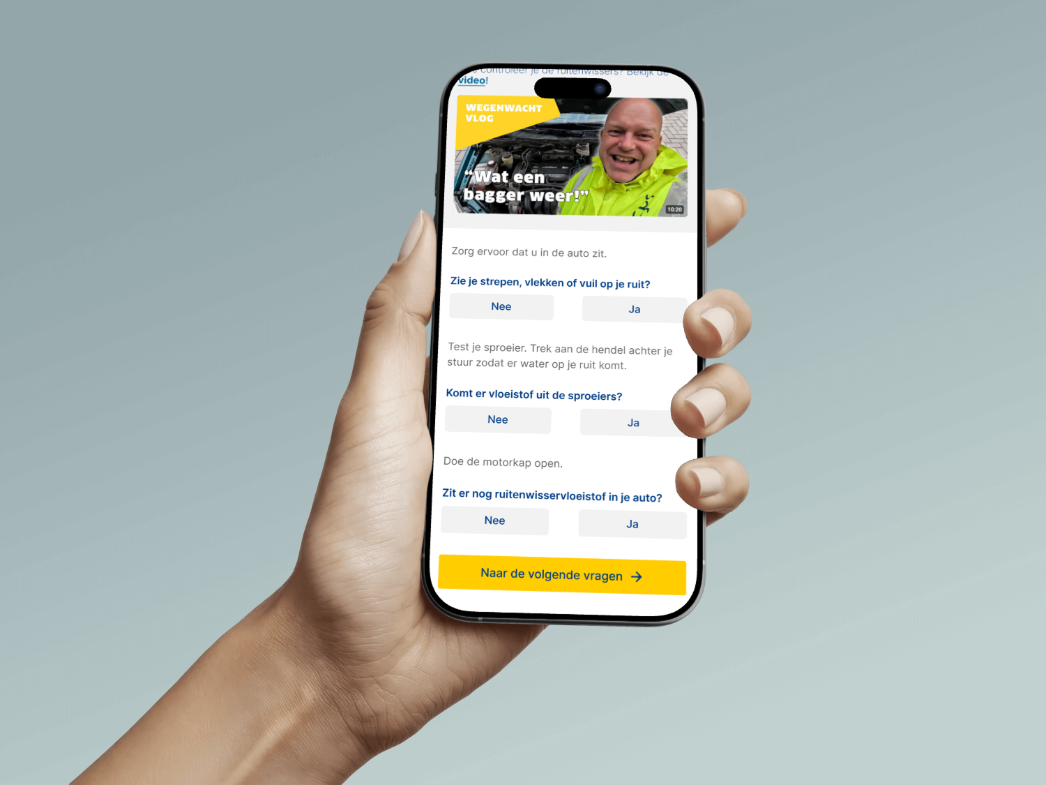
Progress indicator "1 of 3." Tests showed users wanted to know where they were in a process. A simple step counter at the top of each page kept them oriented.
Tip line "Make sure you're near your car." Test feedback revealed users didn't realise the check works best when they can actually inspect the vehicle. A subtle blue tip line solved that confusion in one sentence.
Red/orange "worn" status alerts. Users immediately understood urgency from the colour and icon. We chose them after testers grasped them without explanation.
Info icons with "Why is this important?" Interviews showed people wanted to take action but didn't always know what. Each maintenance item has a small info icon that opens a short explanation and a relevant How-To video.
Garage finder on postcode. A consistent worry in interviews was "which garage can I trust?" So we added an optional list of ANWB-trusted garages near the user's postcode at the end of the check. Feedback sessions confirmed this built real trust.
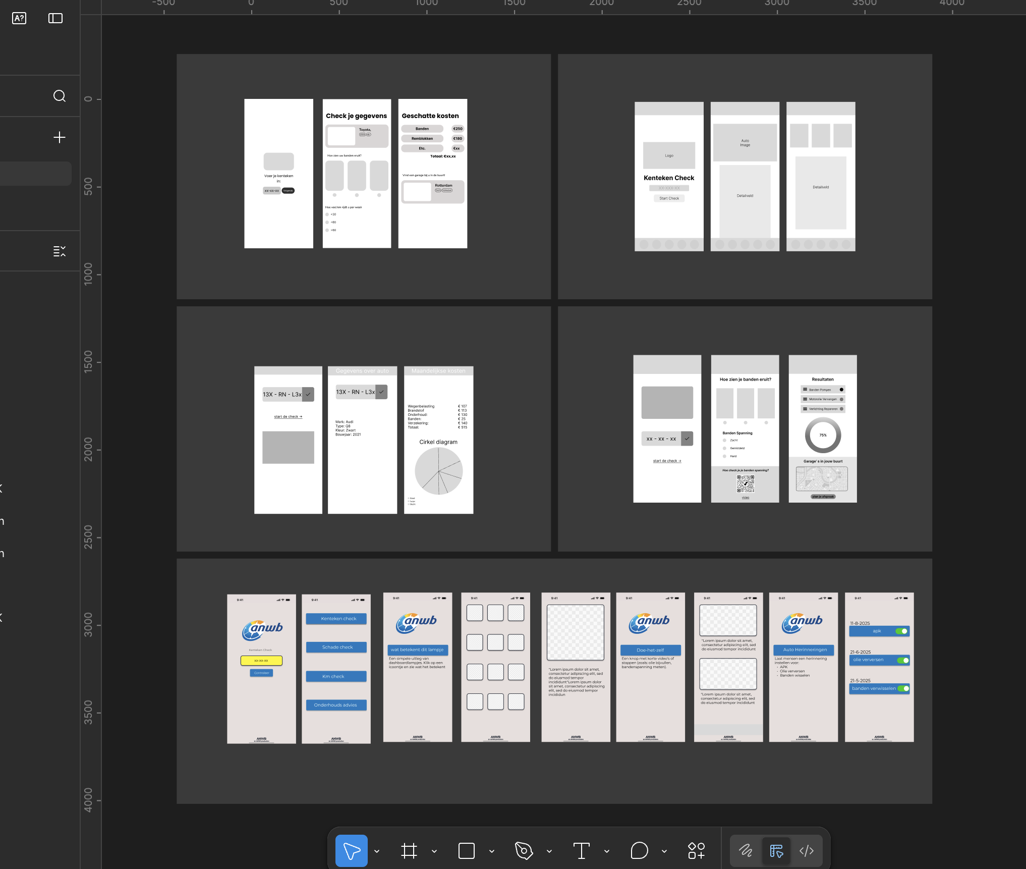
To keep the team aligned, I set up shared text and colour styles in Figma. It wasn't the goal of the project, but it solved a real problem: before that, every team member was making slightly different design choices.
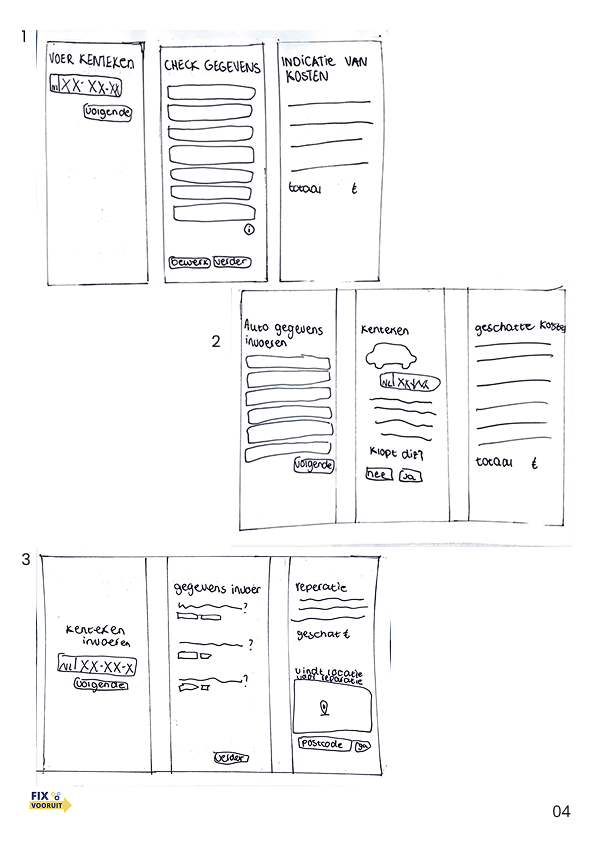
The first version of the prototype showed long technical lists, fewer guidance moments, and no progress indicator. The (test) results gave us valuable insights: users needed clearer navigation structure, guidance inside the app, and features like a trustworthy garage finder.
Based on this feedback I added extra explanations, timelines, warnings, and simple step-by-step plans. The mobile-first decision came directly from observing that most testers opened the page on their phone.
Mobile UI isn't about fitting everything on a small screen. It's about deciding what doesn't belong there.
During the final test rounds and the expo we collected feedback that the team would use to push the prototype further:
An interim status overview. Users wanted more confirmation while progressing through the check. A status bar or overview page showing which parts are filled in, which are still to come, and whether each is in good condition or worn.
A flexible menu or tab structure. Some users preferred picking which maintenance part to start with (tires, oil, brakes), instead of following the linear flow.
Collapsible explanation tabs. The short texts about why maintenance matters and the How-To videos were valuable, but made the page feel busy. Wrapping them in expandable tabs would keep the overview clean while still giving users full access on demand.
This project taught me that mobile UI isn't about fitting everything on a small screen. It's about deciding what doesn't belong there. The hardest design decisions weren't about layout or colour, but about what to leave out.
It also showed me how much a consistent visual language helps a team. Once everyone works from the same styles, the conversations shift from "does this look right?" to "does this work for the user?"